As a longtime android user, thank God they're finally listening and focusing on the most important problems!!!
Welcome to the droidymcdroidface-iest, Lemmyest (Lemmiest), test, bestest, phoniest, pluckiest, snarkiest, and spiciest Android community on Lemmy (Do not respond)! Here you can participate in amazing discussions and events relating to all things Android.
The rules for posting and commenting, besides the rules defined here for lemmy.world, are as follows:
1. All posts must be relevant to Android devices/operating system.
2. Posts cannot be illegal or NSFW material.
3. No spam, self promotion, or upvote farming. Sources engaging in these behavior will be added to the Blacklist.
4. Non-whitelisted bots will be banned.
5. Engage respectfully: Harassment, flamebaiting, bad faith engagement, or agenda posting will result in your posts being removed. Excessive violations will result in temporary or permanent ban, depending on severity.
6. Memes are not allowed to be posts, but are allowed in the comments.
7. Posts from clickbait sources are heavily discouraged. Please de-clickbait titles if it needs to be submitted.
8. Submission statements of any length composed of your own thoughts inside the post text field are mandatory for any microblog posts, and are optional but recommended for article/image/video posts.
Community Resources:
We are Android girls*,
In our Lemmy.world.
The back is plastic,
It's fantastic.
*Well, not just girls: people of all gender identities are welcomed here.
Our Partner Communities:
As a longtime android user, thank God they're finally listening and focusing on the most important problems!!!
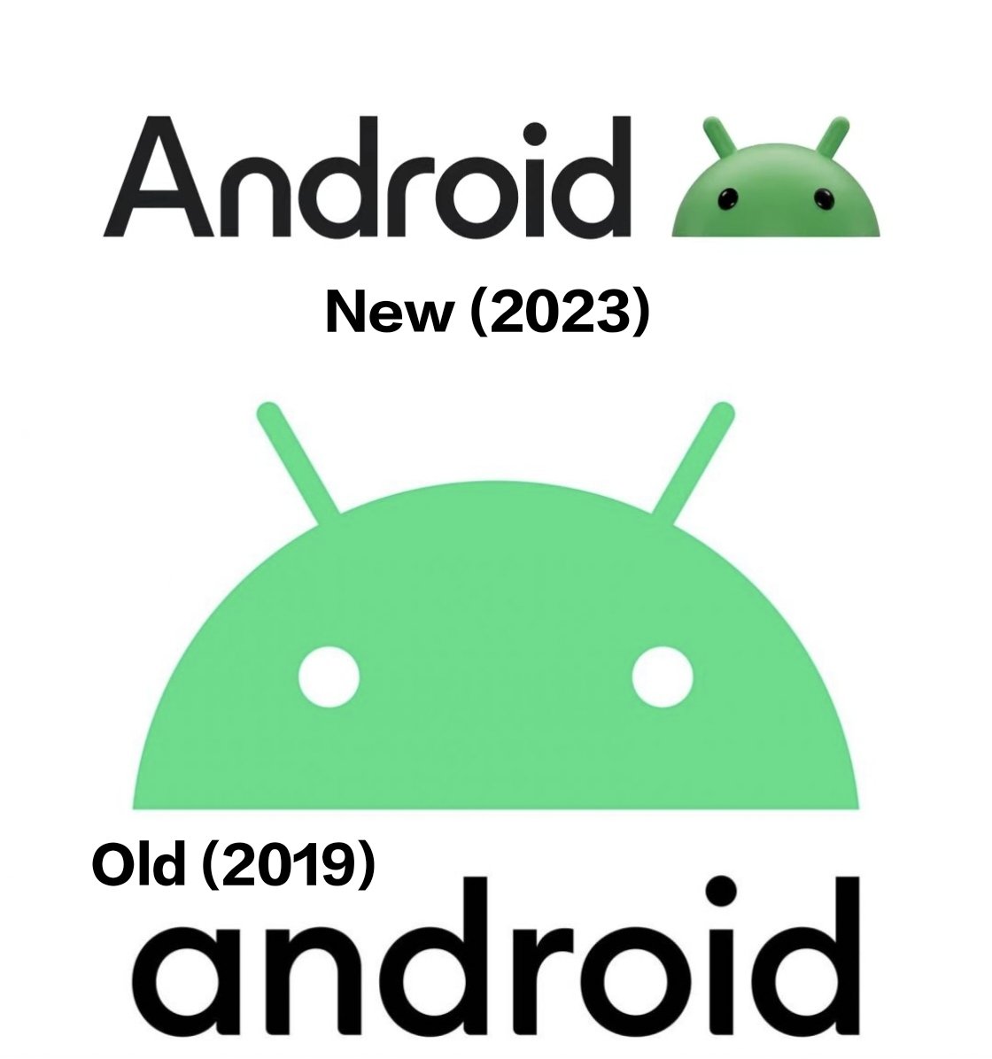
Are we really going for a revival of 00s skeuomorphism? 💀
Is this serious?? Or is this a meme??
Not really into the 3d aesthetic sorry, still too 2010ish for me
I think I actually prefer the simplicity of the old one. In general, I find logos with too many textures a little distracting or "noisy"
Same.
The new one looks like a serious downgrade, imo
Yup. I don't like it.
Can we make up our minds, please?
In the 90s-2000s we had these shaded, almost 3D icons everywhere. Then we transitioned to a flat, minimalist style.
Give us something new and exciting instead of capitalizing on "retro nostalgia"
This leads me to think that Google is planning on an AR/VR product like the Vision Pro and so they want to make 3D icons and UI elements more prominent (to make the transition easier, the same reason we had 3D icons at the start of computers and smartphones as well), kind of like what Apple did in the last 2-3 years with their new Icons (like on MacOS, they added back a lot of depth with Big Sur)
What is old is new again.
Bottom: RTX off
Top: RTX on
Giving up on Material already? But we are only half way through the You upgrade.
I get the feeling Google aren't very joined up
What has Google ever done to make you think the left hand knows a right hand exists?

Here, use this instead.
That's actually a lot better :/
I'm a fan, especially the eyes got more personality to it
We are back to 3D logos? nice