this post was submitted on 11 Feb 2025
509 points (97.7% liked)
Map Enthusiasts
4211 readers
12 users here now
For the map enthused!
Rules:
-
post relevant content: interesting, informative, and/or pretty maps
-
be nice
founded 2 years ago
MODERATORS
you are viewing a single comment's thread
view the rest of the comments
view the rest of the comments
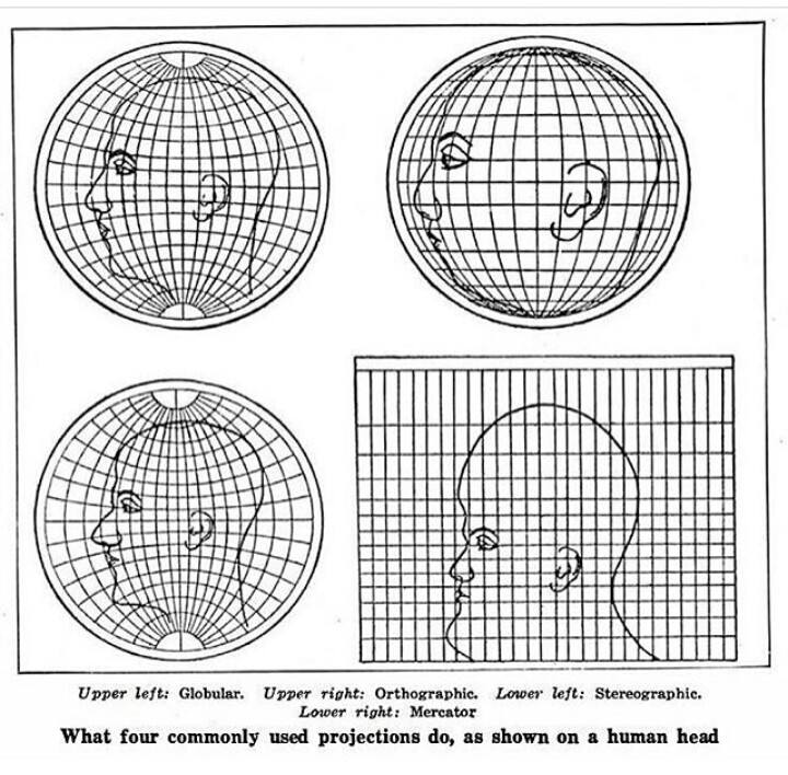
This isn't representing projections of a human head. This is representing projections of the globe if the globe had a giant human head drawn on it instead of the continents.
But then you have to figure out how to transfer the drawing of the head onto the curved surface, and how you do that is going to determine how the projections look.
No, you can ignore that part. The image isn't showing how to accurately draw a head onto a surface, it's showing how this given head drawing would look in different projections.
Projections from what? You don't need a projection for a drawing, it's already a 2d image.
Edit: I realize that you can use it to compare the different projections to each other, but it doesn't show which one is more accurate overall. In this image it looks like they used the globular projection as the "default' with the most realistic drawing, and created the others based on that, but they could have picked any one of them to be the default.
Yes, again, that's the point.
It assumes the sphere projection is correct, and shows how each of the 2D projections isn't correct. This isn't hard.