this post was submitted on 18 Aug 2025
47 points (100.0% liked)

European Graphic Novels++

486 readers
3 users here now

“BD” refers to Franco-Belgian comics, but let's open things up to include ALL Euro comics and GN's. Euro-style artistry from around the world is also welcome. ^^

-BD = "Bandes dessinées"
-BDT = Bedetheque
-GN = graphic novel
-LBK = Lambiek
-LC = "Ligne claire"

Please follow good 'netiquette' & the rules of PieFed.Social when posting & commenting. As for 'fair use' extracts, they're encouraged, but please-- no piracy! Moderation will be based on readers' willingness to follow these guidelines.

The designated language here is English, with a traditional bias towards French. When posting foreign-language content, please include helpful context for English-speakers.

---> Here's our Community Lounge, Webcomix Collection, FAQ, and Resource Page <---

KEY SITES & COMMUNITIES:

founded 2 years ago
MODERATORS
 

This came out in late April it seems, based on its successful "kickstarter." It's 232pp, and evidently features work by six classic BD+ creators-- Enki Bilal, Antonio Segura, José Ortiz, Vicente Segrelles, Sergio Gerasi and Janevsky.

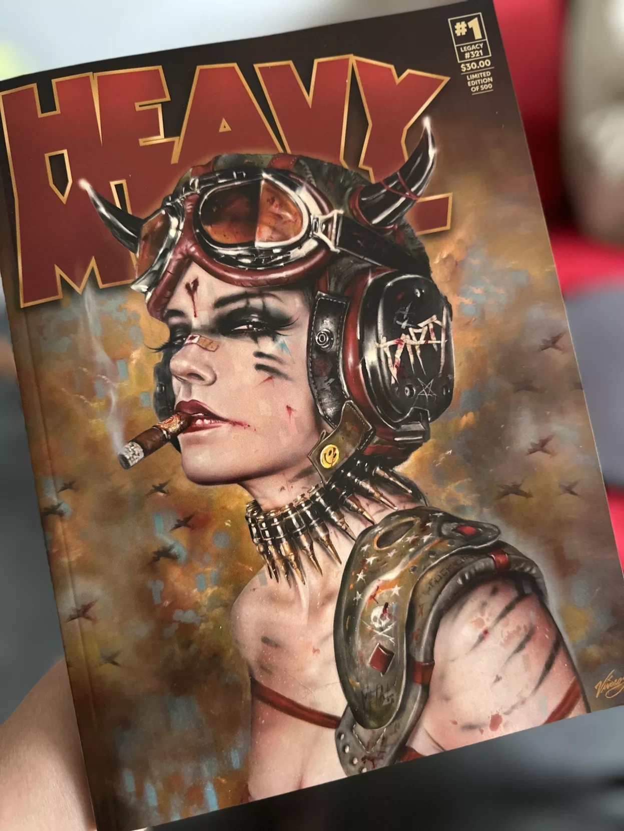
I first saw the cover on Mastodon, and enjoyed the way that photo was skewed a bit, but here's a straight-ahead view if you like:


(right-click as needed)

US$30 seems like a pretty steep price ordinarily, but then again, magazine prices downright skyrocketed during the pandemic, so who knows? Also-- at 232pp, it's arguably a dang-ol' bargain, assuming the content is decent. Especially being a collectible and all. That said, I haven't read it myself, yet.


As for "Cleo," I've never seen her reimagined like that, but it does fit the classic aesthetic of the mag. As a history nerd/moron... eh, I'm going to say it works... somehow! :S

Not to mention, I'm pleased that it's not just straight-cheesecake, which eventually got pretty-dang ridoinkulous in the American version, IMO. (mid-90's, I guess)

Butttt... if you simply must see a clip of the specific art creator working on a 'mini' of the character, it's here [NSFW]: https://www.facebook.com/reel/1014862657234502 [NSFW]


All that bloviated, let's just see how things works out, yeah?

And, yet-- I do kinda *cling* to a certain cynicism which easily biases me, which is that the previous HM magazine-runners (the ones after Kevin Eastman) were near-complete idiots, running the mag pretty-much wholly as a vanity project.

(and now a moment of silence, please, while St. Caragonne blesses their pitiful posteriors, hahaha)

Bah! Anyway:
https://fanboyfactor.com/2025/04/heavy-metal-magazine-relaunches-with-massive-new-issue-1-featuring-returning-legends-and-breakout-creators/

top 15 comments
sorted by: hot top controversial new old
[–] nocturne@slrpnk.net 2 points 2 months ago (1 children)

The $30 for the issue must be because of the cover. I am still able to order A-E covers from my distributor and cover price is $14.99. I never had an option to order cover F.

Issue #2 released this past Friday I believe, and issue #3 is in solicitation.

[–] JohnnyEnzyme@piefed.social 1 points 2 months ago* (last edited 2 months ago) (1 children)

I mean, 232pp is a boat-load of pages, yes?

Would #2 really be up to that same count for a mere $15 or however it is?

All this seem pricey at first blush, but man...!

[–] nocturne@slrpnk.net 2 points 2 months ago (1 children)

Maybe the F cover is a special edition , as I said issue 1 has a cover price of $14.99, the same as issue #2. And while I have not compared the two issues, I do not recall issue 1 being any thicker than issue 2.

[–] nocturne@slrpnk.net 2 points 2 months ago (1 children)

Both issues are 232 pages $14.99 cover price.

[–] JohnnyEnzyme@piefed.social 2 points 2 months ago (1 children)

Oh, pardon the delay here, but how did you like the actual content? For example, both the classic Euro stuff as well as whatever new-ish stuff they added..?

[–] nocturne@slrpnk.net 2 points 1 month ago (1 children)

I have still only flipped through and looked at the pictures. The print is borderline too small for me (unmedicated adhd an eye injury make reading difficult). I did notice there was a bit of content from the OG Heavy Metal movie, I am really looking forward to reading it when I either get a digital copy I can zoom in on or get new glasses.

[–] JohnnyEnzyme@piefed.social 2 points 1 month ago

I have eye issues as well, and feel that pain, compa. I use saline solution and 'artificial tears' to make my eyes feel better, and magnifying devices in order to read fine print, etc.

Anyway, for a digital edition of this issue, I'm pretty sure you can find one at the same types of sites that offer college e-texts.

[–] johanstiel@piefed.social 2 points 1 month ago (1 children)
[–] JohnnyEnzyme@piefed.social 1 points 1 month ago

I thought they already did, or...?

[–] drspod@lemmy.ml 1 points 2 months ago (1 children)

Why the weird fold in the lens of the glasses? Looks very strange to me.

[–] nocturne@slrpnk.net 10 points 2 months ago (1 children)

Because that is how those goggles were made?

I do not know that these are the same model, but at least close. https://www.worthpoint.com/worthopedia/wwii-british-stadium-aviator-pilot-496807112

[–] drspod@lemmy.ml 3 points 2 months ago (1 children)

Oh wow that's way more visible than I thought it would be. Thanks.

[–] orbituary@lemmy.dbzer0.com 0 points 2 months ago (1 children)

You say it as if you knew what these were before you asked the initial question.

[–] drspod@lemmy.ml 4 points 2 months ago (1 children)

Of course I've seen this type of aviator glasses before, they're practically a staple prop in any WW2 costume dept. The bend in the illustrated version is just so absurdly exaggerated that it defies the image that you have in your memory of how they look.

[–] nocturne@slrpnk.net 5 points 2 months ago

When I was a kid my dad rode a motorcycle and this was the pair of goggles he wore while riding, the image does look almost over exaggerated.